The Project
As the UX/UI Designer, I worked with my teammates to analyze the usability of Amazing Lash Studio’s website for a clean redesign and new functionality.
- OUR ROLE: UX/UI Designer
- TOOLS: Miro, Figma, Excel, Google Slides.
UI/UX Case Study & Redesign

As the UX/UI Designer, I worked with my teammates to analyze the usability of Amazing Lash Studio’s website for a clean redesign and new functionality.
During our usability tests, we discovered that users felt lost and frustrated navigating through the website. Users expressed a preference in having the necessary information compiled within the homepage.
Therefore, we discerned that the Amazing Lash Studio homepage did not provide adequate information for first-time customers. We might be able to help if we incorporate: service details, aftercare information, and first-time visit information on the homepage.
We do this by using an appropriate balance of text and meaningful imagery in order to avoid overwhelming the user. Doing this will allow our product to become informative, accessible, and digestible for first-time customers.
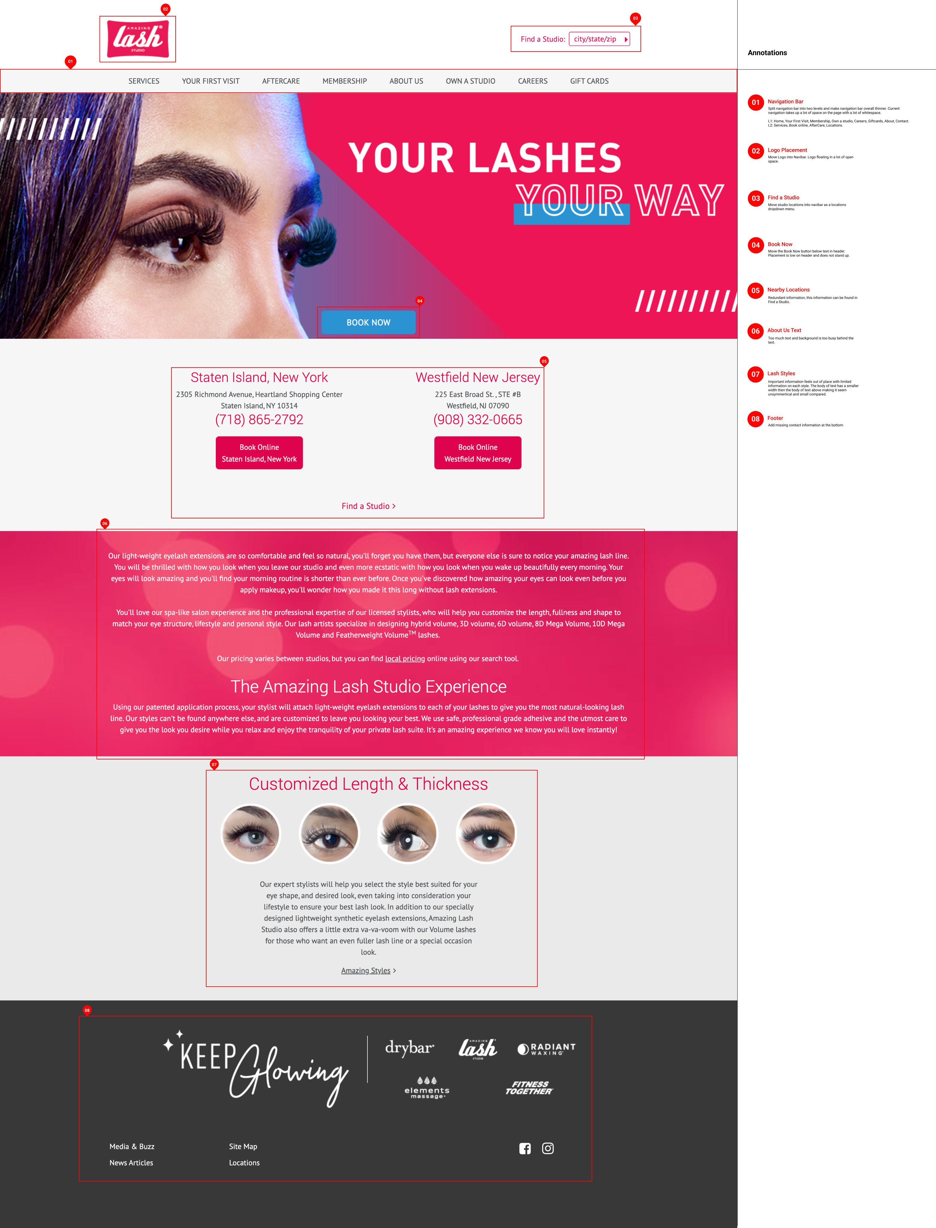
Before

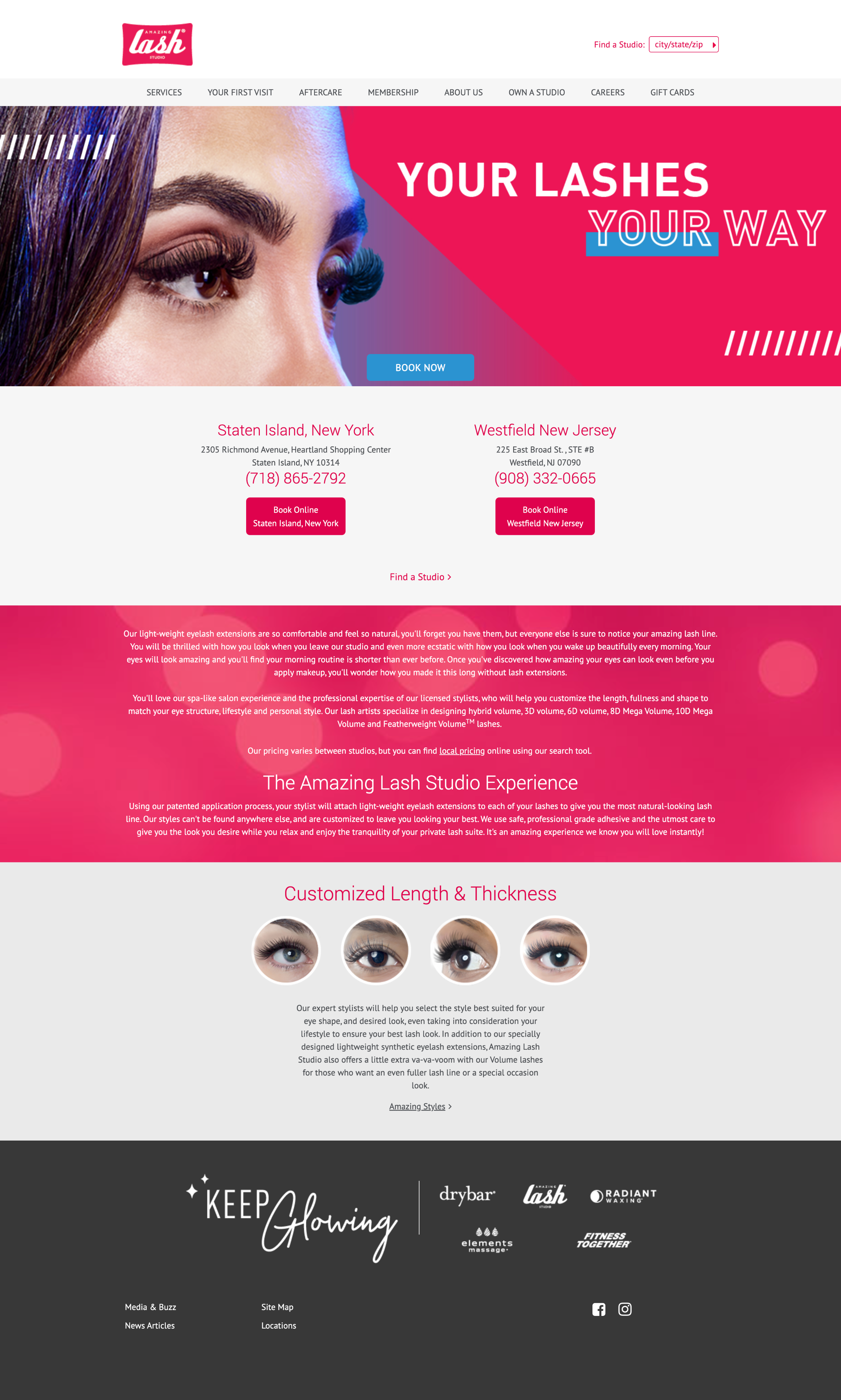
After
The Amazing Lash Studio is a franchise that offers lash extensions, lifts, and tints. We have observed that the information on our current site is confusing due to the placement of its text and the odd footer design. This would be unattractive to site visitors causing them to seek out other lash service providers.
By re-designing The Amazing Lash Studio's website we will be providing users the ability to smoothly set up appointments and find the perfect lash set for them. Information about the array of lash services will be available so that users can know what to expect before and after booking an appointment.
Before

After

Collaboration: This is our first time designing and coding a website as a group. Since we have already had experience coding our own portfolio websites, we did have an idea of our individual coding capabilities. We all were able to decide what areas we felt most comfortable in and went from there. Through this project we learned how split coding work and try to match our separate designs.
Designing Features: Throughout this case study, we had many ideas of features to add to our website. We tried to stick to a similar color palette as the original as well as simplify the information on the site.
Iteration Opportunitiess: We received a lot of valuable feedback from our users during testing. These findings helped us figure out what would be the most efficient way to iterate our prototype. Through this experience, we learned what additional features to add to our website based on our user findings.